What is a Mega Menu
A mega menu is a type of navigation menu used on websites to provide a highly organised and visually rich way for users to access various sections and content on a website. It's typically a large, multi-column dropdown menu that can display a wide range of options and sub-options when a user hovers over or clicks on a menu item.
Here are some key characteristics and reasons why using a mega menu can be a good idea for a website:
- Organized Navigation: Mega menus are excellent for websites with a lot of content or a complex structure. They allow you to categorise and organise information into logical sections, making it easier for users to find what they're looking for.
- Visual Appeal: Mega menus often include images, icons, and even short descriptions alongside menu items, making the navigation more visually engaging and helping users quickly identify the content they want.
- Efficient Use of Space: Instead of taking up valuable screen real estate with a long list of menu items, mega menus use space efficiently by displaying content in columns or grids. This makes it possible to showcase a large number of options without overwhelming the user.
- User-Friendly: Mega menus are user-friendly because they are easy to navigate. Users can see all the available options at a glance and choose the one that interests them without having to click through multiple levels of navigation.
- Improved Accessibility: When designed properly, mega menus can enhance the accessibility of a website. They allow screen reader users to quickly identify and navigate to different sections of the site.
- Promotion of Key Content: Important or featured content can be highlighted prominently within a mega menu, helping to draw attention to specific products, services, or information.
- Reduced Bounce Rate: By providing a well-structured and user-friendly navigation system, mega menus can reduce the bounce rate on your website. Users are more likely to stay and explore your site when they can easily find what they need.
- Responsive Design: Modern mega menus are often designed to be responsive, meaning they adapt to different screen sizes, including mobile devices. This ensures a consistent user experience across various platforms.
- Customisation Options: Mega menus can be customised to match the branding and design of your website, creating a cohesive and professional appearance.
- Analytics and Insights: Mega menus can provide valuable insights into user behaviour and preferences through analytics. You can track which menu items are clicked the most, helping you make informed decisions about your website's structure and content.
While mega menus offer many benefits, it's essential to use them thoughtfully. Overloading a mega menu with too much content can lead to confusion, so it's crucial to strike a balance between providing ample options and maintaining a clean and organised user experience. Additionally, usability testing and user feedback can help you refine your mega menu to meet the specific needs of your audience.
How do I set-up the built in Mega Menu in VirtueMart Templates
The built in Mega Menu is simply a single menu with Modules displaying where you would expect to see the menu drop down. The module potions are directly associated to the menu alias of the menu item you would like the module to be associated with. You can add up to 12 modules into the the newly created custom module position.
A Mega Menu is not to be confused with a normal Joomla drop down menu where the sub item as added as a nested item within the menu.
We are using the Hypershop template as an example. More details specific to each template is shown on the specific templates documentation.
The steps are as below.
- Create the initial top level menu
- Add it to the correct module position
- Create modules to be assigned to each of the top level menu items.
- Assign these modules to the relevant custom module positions.
Plan the mega menu
To plan the mega menu you need to decide the main menu headings.
In the case of the Hypershop, this is displayed as below

Then you need to create modules (and associated menu's) for the modules to be shown under the relative parent item.
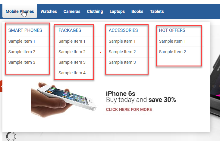
In this case below, we have 4 modules (of type Menu) under the first heading of Mobile Phones.
TIP: You will need to create the menus, before you create the relative modules.

menu-position-1-mobile-phones (mobile-phones is the alias of the parent menu item Mobile Phones as shown as above. )

menu-position-2-mobile-phones (mobile-phones is the alias of the parent menu item Mobile Phones as shown as above.)


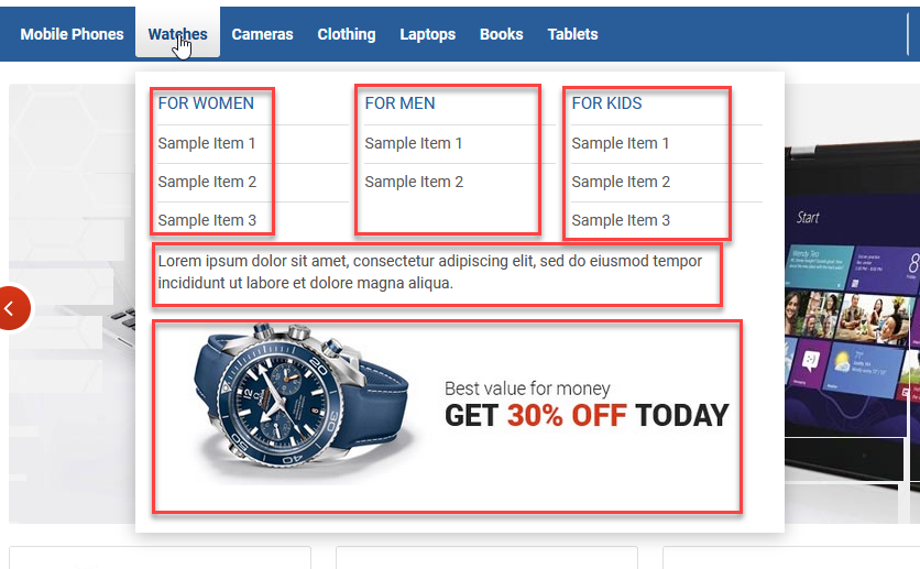
menu-position-1-watches (mobile-phones is the alias of the parent menu item Watches as shown as above.)

menu-position-2-watches (mobile-phones is the alias of the parent menu item Watches as shown as above.) 
menu-position-3-watches (mobile-phones is the alias of the parent menu item Watches as shown as above.)

You can add up to 12 modules into one module position. There is available 3 modules position which can be used with menu items as following:
menu-position-1-MENU_ITEM_ALIAS
menu-position-2-MENU_ITEM_ALIAS
menu-position-3-MENU_ITEM_ALIAS
So, to use modules positions under Watches menu item as on our demo simply add watches alias to could publish modules:
menu-position-1-watches
menu-position-2-watches
menu-position-3-watches
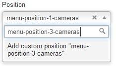
IMPORTANT! - please note the modules positions are not available on the list of predefined modules position in module settings. You need to type module position name in Position field as following:


